Components
Tab
A set of Tabs allows users to navigate through multiple pages within the context of a higher order grouping.
Overview
Tabs divide content into meaningful, related sections.
Tabs are used to group different but related content, allowing users to navigate views without leaving the page. Tabs can be used on full page layouts or in components such as modals, cards, or side panels.
Anatomy
Desktop

Mobile

M
Mandatory
O
Optional
Structure
Recommended max number of tabs is five (5).
Tab group is horizontally structured. For vertical segmentation, see Tree nav.
- Tab: contains text label and icon.
- Tab group: contains all tabs.
- Active indicator: highlights the active tab
- Overflow indicator: chevron that dynamically appears on either side of the tab group when the combined tab width is greater than the tag group width.
Clickable / Unselected
Unselected Tabs denote the other available tabs.
Clickable / Active
Selected Tabs denote the currently active tab.

Disabled
A tab item in a disabled state shows that the tab item exists, but is not available in that circumstance. This state can be used to maintain layout continuity and to communicate that the tab item may become available later.
Width
Tab Group takes up the full available width of the section.
Tabs take up the full available width of the available grid. They may need to scroll horizontally.
Keyboard Interaction
Use Left Arrow or Right Arrow to move between tabs
Press TAB to navigate the content inside a tab
Components


Tokens
Tab content 0
Tab content 1
Unselected
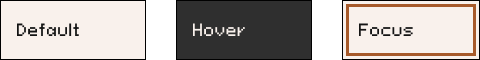
Default
Label = $global-action-content-primary-color-default
Icon = $global-action-content-primary-color-default
BG = $global-action-surface-primary-color-default
Border = $global-static-border-color-default
Focus = $global-action-border-color-focus
Hover
Label = $global-action-content-primary-color-hover
Icon = $global-action-content-primary-color-hover
BG = $global-action-surface-primary-color-hover
Border = $global-static-border-color-default
Focus = null
Selected
Default
Label = $global-action-content-primary-color-active
Icon = $global-action-content-primary-color-active
BG = $global-action-surface-primary-color-active
Border = $global-static-border-color-default
Focus = $global-action-border-color-focus
Active bar = $global-action-border-primary-color-active
Hover
Label = $global-action-content-primary-color-hover
Icon = $global-action-content-primary-color-hover
BG = $global-action-surface-primary-color-hover
Border = $global-static-border-color-default
Focus = null
Active bar = null
Disabled
Default
Label = $global-action-content-color-disabled
Icon = $global-action-content-color-disabled
BG = $global-action-surface-color-disabled
Border = $global-static-border-color-default
Focus = null
Hover = null